Posts

Creative Critical Reflection

https://youtu.be/wz6ZfeA4lbY After many months of production, my magazine is complete! This link takes you to my creative critical reflection of it.

Completed Table of Contents Discussion Part Two

The journey of production lasted quite a long time, as I would add more and more to my spread overtime. This piece took the longest to create out of all the magazine features. My planning transferred to a clean transition into actual production, as I struggled less with design since it was pre-planned. I used a sense of branding by using techniques that made for a more visually-appealing magazine table of contents that would appeal to my audiences. Having this picture of Kisses is sure to garner attention out of cuteness. Having gradients makes for a prettier spread and makes it better for focus. Thus, cuteness, interest, and awareness to bring out positive change to the lives of many dogs and cats. Several tools were implemented to create my final product. I used Walsworth to plan layouts for my spread, allowing for digital planning. Adobe InDesign was primarily used to bring out the plans to life as this platform provided many tools for deign. I used Photoshop as well to heighte

Completed Table of Contents Discussion Part One

Image
The following is an analytic look of the process of creating my table of contents. I used lighting effects to alter my image. Because it depicts a happy dog at the beach, increasing the lighting makes the picture much brighter, and a bright, sunny day at the beach is great fun. This depicts making animals happy and enjoying time with them happily, which is what my magazine attempts to catch. The setting of the shot, the beach, is a place of vacation, relaxation, and just plain fun, so taking your pet here shows good ownership and love.  I researched other pet magazines to learn the typical structure of them. I learned the modern design choice of using half the spread for a picture and half for the contents. I also learned using a gradient allows for the features to stand out, so I used this on my spread. On top of that, I decided to apply this to the title and headings of the pages to make them standout as well. My audience research shows that they like eye-catching content

Completed Spread Part Two

This is a continuation of the discussion about how my feature spread was completed and why it came out how it did in the final product. I made decisions based on my sketch. I was on limited time when designing my spread, so I decided to go by the drawing only. Either way, I enjoyed how the sketch came out, and the spread looked nice when making it on InDesign. The only revision I made was the subject of the spread and the miniature pictures on the left page. I had originally thought of making my spread about toys, which are favorites of pets, which could actually be useful to strays, etc. I changed this because I realized that not many people have toys for their pets, but everyone has them eating. I also was planning about having miniature crop outs on the left page, but I realized that because of my style I had limited space, only allowing me to have one picture. Regardless, I like this simplistic, more modern style, and those that I showed my work to agreed. Throughout the jo

Completed Spread Part One

Image
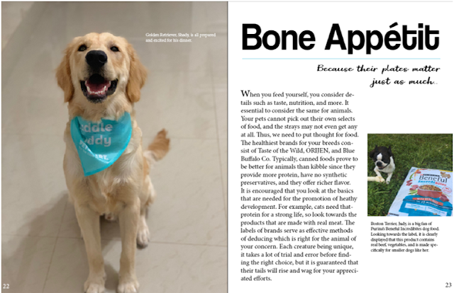
This is my completed spread for Paw in Hand , and it is about feeding pets and strays. I used props to illustrate the topic of the spread. On the left, the pet dog has a cute bib on. This large closeup of this photogenic dog with a big smile with a bib shows that it is eager to eat and makes for an overall adorable shot. By making it encompass the entire page, it holds attention and pleases the hearts of readers. On the right, my dog is seen smiling next to a bag of dog food. This is an intentional pose, as this shows that the dog enjoys her food. I looked at Catster spreads to get inspiration for my own. I saw that they used one page out of the spread to focus less on writing, and more on the image. I also looked to my audience, as the majority of people that are concerned with the welfare of animals find them cute. Thus by providing them with a focus on cute pictures and less on writing, since people would not want to read large columns, and rather look at the pets and

Completed Cover Part 2

This post is a continuation of the previous in which I discussed the process of finalizing my magazine's cover photo. I made decisions and revisions as I was actually designing the cover page on my computer. I though that I woulds stick to my plan, yet I realized that using an unfamiliar program and having models that did not allowed for my desired shots made me have to change the design. I decided to look to other covers for inspiration. I made decisions based on brainstorming and making many custom designs, such as an attempt to make a paw print (seen below). By seeing how well I could execute those designs and ideas, I made do and created the cover shown in the last post. Starting off by just looking at Caster  magazine covers, I wanted to be unique and stand out with a different, more difficult cover to make. I started off with heavy emphasis on helping strays, and this transitioned to strays and pets. But with the ready availability to photograph pets, I began focusing mor