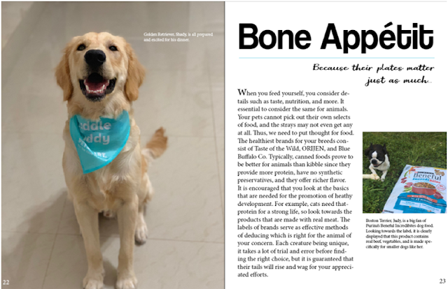
Completed Spread Part Two
This is a continuation of the discussion about how my feature spread was completed and why it came out how it did in the final product.
I made decisions based on my
sketch. I was on limited time when designing my spread, so I decided to go by
the drawing only. Either way, I enjoyed how the sketch came out, and the spread
looked nice when making it on InDesign. The only revision I made was the
subject of the spread and the miniature pictures on the left page. I had
originally thought of making my spread about toys, which are favorites of pets,
which could actually be useful to strays, etc. I changed this because I
realized that not many people have toys for their pets, but everyone has them
eating. I also was planning about having miniature crop outs on the left page,
but I realized that because of my style I had limited space, only allowing me
to have one picture. Regardless, I like this simplistic, more modern style, and
those that I showed my work to agreed.
Throughout the journey of making
this spread, I clung to the idea of one page being a picture, the other having
the writing. I kept this in mind on my initial sketch to the final product.
Evidence in this is this spread taken from an issue of Catster. This shows the design choice that I wanted, and this was
actually the initial source of the idea. For this portion, I branched out and
asked people that are not in my close circle of friends for access to their
pets. I wanted to focus more on pets here since pets are more often fed than
strays, and there is more of a owner’s-choice influence on their diets, but the
concern for strays is still there. Thus, this journey was one full of pets. I
went out and bought a bag of dog food that would be specific to my dog, as this
is what my spread discusses. Speaking of the discussion, I formulated this
based off the copy writing that I have experienced in my yearbook class.
I
focused on branding by making my magazine memorable, making it stand out. I
feel by design accomplishes this. I feel that most of the other students used up
both pages to fill the spread with pictures and flood it in text, but mine
adopts a much more basic technique. I feel like this is modern, and it is more
professional to me. The division between full picture and text is something
that is remembered as, like I said, most people would not do this. Plus, that
picture is designed to be extremely cute so that it catches attention and makes
people go “aww.”
I
primarily used Adobe InDesign to make my spread. This was where I did layout
edits, uploaded pictures, etc. The fancier, more aesthetically-pleasing fonts
were made using DaFont.com, where I used the Snipping Tool to take example
versions of the fonts that I filled with desired text to avoid having to
download the actual fonts. I used Microsoft Paint as a way to pull out the
light blue color of the dog bib and use it on the right page for a design
choice (consistent color).


Comments
Post a Comment