Posts

Planning Photo Shoot Part Two

Crew My team for picture taking will be me and my mother. She would drive me around the city and also keep her eyes out for strays. She would also drive me to homes of pet owners. She can also take me to pet shops. She has already started aiding me with my magazine, as I had to ask and explain to her why I needed her to take a picture of a cat on the grass as we were picking up groceries. To a lesser extent, my friends would help me get pictures by helping me prepare shots with their own pets. Post Processing I do not have experience editing, but today's modern technology allows me to tinker with contrast, colors, etc. I think I prefer leaving the pictures unedited, however, to show the blatant truth. I will not make a picture of a starving cat look cute with filters. This is what these animals look like, do something if you want it took look nicer. If anything, I have a friend that was trained in Photoshop, and he can assist me by teaching me how to improve shots. Types of ...
Planning Photo Shoot Part One

The pictures for my magazine will primarily be about animals, cats and dogs, in different settings and with different props. The following are my plans for carrying out my photo shoot(s). Idea The idea or concept or The Paw's pictures would be of cats and dogs in certain scenarios that visualize the topic being discussed. I will photograph both pets and strays, and have shots of them in a loving setting, a cold, alone setting, having fun, being anxious, etc. The idea is to have a split between those that are loved and those that are not, in attempt to improve the well being of animals in both sides of the spectrum. By showing a stray near a Walmart, you can see that strays are close to home, and how easily they can be supported yet are not, despite food, water, people, shelter, and toys being so close to them. By showing a cat eating one brand of food when faced with three brands, you can see which type of food your cat may prefer. Either way, the goal is to spread care. ...

Fonts, Color, Layout

Image
Some time has passed, and I have reflected what Catster and Dogster has done, and I thought of my ideas. But thinking is for planning, now is the time for action. Font Choice I have mentioned it several times, but I think that having a serif font is a good idea because my magazine deals with serious topics (mistreatment of animals). Since serif fonts seem more formal, it matches with a more serious nature of topics, so I would like to use them for those portions of The Paw. I have recently decided to use sans-serif fonts, but for the more friendlier and happier portions about caring for pets. Sans-serif fonts have a friendlier effect, so I think it would match with the pages talking about loving and being friends with pets. For Titles: Abadi (around 48 pt) and Cambria (around 48 pt) For Subtitles: Abadi Extra Light (around 28 pt) Cambria Math (around 28 pt) For Copies: Franklin Gothic Book (around 16 pt) and Bell MT (around 16 pt) For Captions: Gadugi (around 11 pt) ...

Codes and Conventions of Catster and Dogster

The conventions and codes of a magazine are the signs with meaning and the accepted way of making it. My partner and I did sister magazines, Dogster and Catster, to precisely analyze these techniques. In doing so, we aimed to find techniques that we could apply to our own magazines. In terms of the cover, both magazines had an enlarged photo of a single animal (dependent on whether it is Catster or Dogster) towards the center. These visually tell viewers that the magazine will be about taking care of animals. We would keep this as it depicts purpose and theme in a simple manner, and it is also visually appealing. Catser's mastheads go for a serif font, and so does Dogster. The effect of such a font is evoking formality, but the style of the text is jovial at the same time. This means that it will be very enjoyable and pleasant to read, so we would both mimic this in our own work. For Catster, 2/3 of the issues has the main image (the animal) going over the masthead. Dogster only ...

Researching Catster

Image
        After analyzing all the different parts of the magazine, doing background research of Catser allows for understanding of the reasons why they styled the magazine the way they did. Knowing the information such as audience, purpose, and history explains why certain techniques were used. Learning about these may influence how I will make my magazine, for Catster magazine is similar to what I intend, so by having similar purposes and audiences, it makes sense that I adopt the steps it has taken for its own work.         The audience for Catster magazine consists of cat lovers and cat owners. Their target influences their work, for if they want to sell to cat fans, they have to make a feline-based magazine. My own audience is similar but not exact. While it does include cat lovers and cat owners, I want to branch out to other species like dogs. It is also not pet specific, since I will cover the well being of strays. Thus, my magazine...

Catster Feature Spread

Image
        Today's entry is based on the feature spread. The feature spread are the pages usually about the dominant photo on the cover on the magazine issue. If something is the dominant photo, that means it is largely important, or the best feature in the issue, so it makes sense that a lot of effort would go into creating a certain look or design on this spread. Catster, the animal care magazine I have analysed in the past, will provide three different feature spreads that will be compared. Through this, I will retain certain techniques that I learn about.         First off, one issue makes use of both pages of the spread for the article, the other two only use one page and use the second for either a large picture or an ad. Using both spreads for the article allows for more discussion and elaboration of the issue. Using the large picture allows for more visual appeal, while using an ad benefits the publisher and could also benefi...

Catser Table of Contents

Image
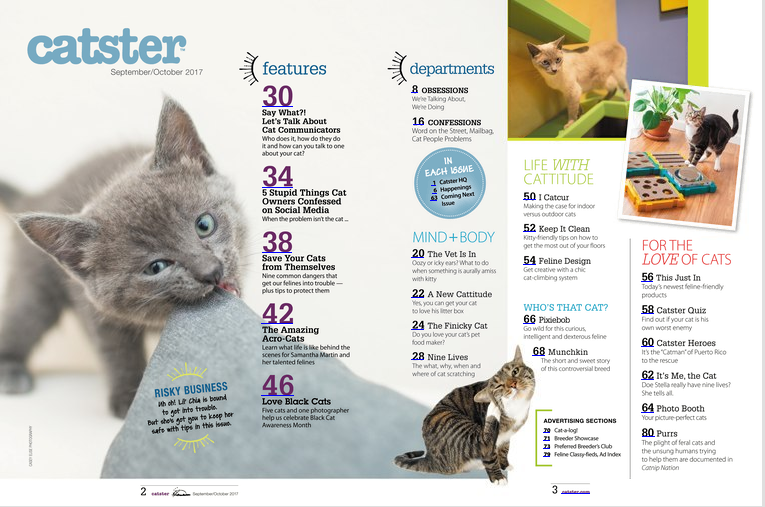
        Today, I will be doing something similar to the last post. However, instead of comparing the covers of three Caster magazines issues, I will be comparing the table of contents of three different issues. The purpose of the table of contents is to showcase what will be featured in the magazine. It is typically one of the first things that a person sees, as they would want to know what the magazine contains. Thus, it makes sense to want to create a certain style within your tables of content that would me memorable and enticing. By comparing the Catster magazines, I will make note of the efforts made to accomplish that, talking about them and taking from them for my own magazine's table of contents.         Each issue has 80 pages. This forms consistency; it makes it a memorable trait of Catster. Not only are there 80 pages, but each magazine divides those pages into the same sections, and some pages are kept with the same topics/...