Fonts, Color, Layout
Some time has passed, and I have reflected what Catster and Dogster has done, and I thought of my ideas. But thinking is for planning, now is the time for action.
Font Choice
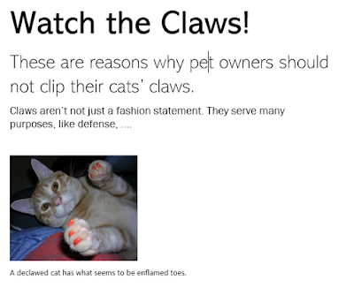
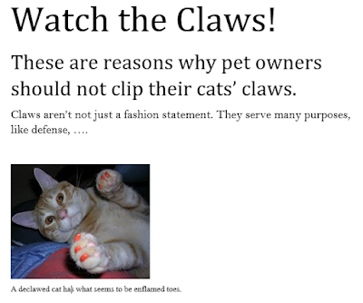
I have mentioned it several times, but I think that having a serif font is a good idea because my magazine deals with serious topics (mistreatment of animals). Since serif fonts seem more formal, it matches with a more serious nature of topics, so I would like to use them for those portions of The Paw. I have recently decided to use sans-serif fonts, but for the more friendlier and happier portions about caring for pets. Sans-serif fonts have a friendlier effect, so I think it would match with the pages talking about loving and being friends with pets.
For Titles:
Abadi (around 48 pt) and
Cambria (around 48 pt)
For Subtitles:
Abadi Extra Light (around 28 pt)
Cambria Math (around 28 pt)
For Copies:
Franklin Gothic Book (around 16 pt) and
Bell MT (around 16 pt)
For Captions:
Gadugi (around 11 pt) and
David (around 11 pt)
Examples:
Color
I want to use colors to signify different sections of the magazine. I had explained this in a previous entry, but in my yearbook class, we dedicated certain colors to certain sections so that you would be able to identify where you are and what to expect, and it helped with organization. I will apply this technique into The Paw. In my sketches, you can see that I have made four sections, and given them their own colors: blue, red, green, and orange. The colors would be applied to the titles so that readers could be aware of the current section easily at anytime during reading.
Layout
In my sketch of a spread, I have shown what my layout would look like. I would like to use one page for a large animal image that would visualize the topic, and the other half would contain the topic. I will use a minimalist approach, meaning not clustering the page with text and images. It would look more modern. Also, I would like to add designs that reflect the theme, either in a cutesy or a more formal way. Looking at the sketch I made for the feature spread serves explanation more justice, so see it in the next entry.


Comments
Post a Comment