Catster Issue Comparison


Today, I will be comparing the covers of three issues of Caster, a magazine centered on caring for pet cats. I chose this because my own magazine will also be about the wellness of animals, although mine is not focused on pet felines. Rather, The Paw, my magazine, would focus on all species of animals, and it would provide tips, advice, and news to promote well-being of both pets and strays. In terms of this post, I will be showcasing the features evident in each cover, comparing them to show how they are either similar or different. I will then discuss their impact and what I will transfer onto my own work. Determining the convention, or the style and form, that an animal care magazine adopts allows me to learn how this genre is done.
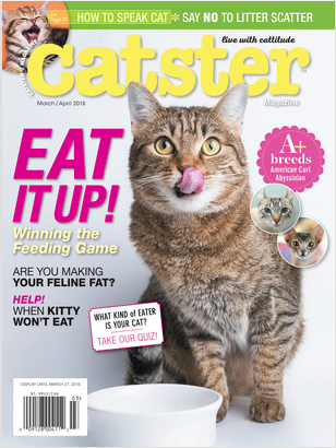
Starting off with the first thing that catches my attention, the main images are all in common. Each issue has a single enlarged cat in the middle of the cover, taking up the majority of the space. Beyond just this, the cat in each is being cared for. One of them are feeding from a bowl, another is drinking from a tap, and the third is wearing a scarf given to it buy its owner. The purpose of these are to emphasize that the magazines are about taking care of pets. I like how the single cat in each is done because it stands out, and it makes you aware of what awaits in the pages. If I see a cat in a tiny scarf, I think that of pet owners treating their animals with love. What I take from this is the effect of symbolism (the bowl and scarf for example). I think that I would, however, use two cats. The two cats would have different symbolism with them. One would have signs of being a loved pet, so perhaps a play set or scratching post. The other would show signs of being a stray that is receiving aid, so perhaps a dirtied car with fresh food placed next to it under a bench. These would also be placed in the center to grab attention and suggest urgency.
Next I would like to discuss the masthead. They all use the same serif font. The serif style font gives off the feelings of formality, establishment. I also find these more visually appealing. Because I want to bring attention to better treatment of pets and strays, an issue I consider serious, I would want to show off formality. The colors are not all the same, but 2/3's are in white, which means that the color is chosen after the cover is selected. Thus, my font color would be dependent on what I use as my cover, but it would for sure be a color that stands out greatly that would also help grab attention. Also, two issues have the main image going in front of the masthead, while the third does not. The way that I see it is that when the main image covers the masthead, it implies seriousness of the topic. I would want to make my own main image cover the title because it would then show that names come second, the first thing we need is to spread awareness, to take care of these creatures.
The main coverlines in each highlight a tip that will be provided to readers upon opening the magazine. One utilizes a normal font, while the other two make use of a text that seems like it is written by hand. These other two stand out more to me since they are different. Since I want animals to be treated better, I would want tips to stand out, so I will probably make use of something similar. On fonts, the characters on the issue main coverlines are either all capitals, all lowercase, or regular. The all capital one evokes more urgency, so I will use a font that has this character style to also make use of the effect.
I liked the use of puffs on two of the covers. One of them is a box, there is a circular stamp design, and a tiny circle. Since puffs stand out, I would like them on my cover. In terms of the context they hold:
Buzzwords are utilized by Catser in order to entice viewers of the cover. With the offer of a quiz and with "OMG", I actually feel like opening the magazine to see what is inside. These are more playful buzzwords because Catster attempts to promote happiness due to their topic: making pets happy. I would not want my buzzwords to mimic this happiness because I am not having fun with the stray side of my magazine, but I would think a quiz would be nice. Rather than the fun little which cat are you, maybe I could make a "which cat toy are you". The purpose of this would be to show off different products and their prices, so that owners and other readers become aware of them, increasing the likelihood that they would purchase them to give them to their pets or to donate them.
Although Catster has variations from issue to issue, evident with these three, it has a set way of doing things. That way of doing things is useful to me, as I have a similar goal to this magazine, so the notes I have taken are meaningful. Previously, I had no set model to how I want my magazine to look. These examples give me a start, and so I am glad that I was eventually able to compare three covers.

Comments
Post a Comment